
The marketing automation system is your oyster when it comes to everything from database hygiene to lead nurturing to my personal favorite… *drumroll please*… A/B (aka split) testing, or the process of comparing two versions to determine which version is the better performing one.
Perhaps you’re an experienced marketer already well-versed in the world of A/B tests and just need some inspo. Or maybe you’re an eager learner who wants to venture into testing emails and don’t know where to start. Either way, I hope you can benefit from these ideas that have helped me along the way:
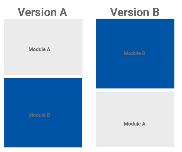
Idea #1: Experiment with module placement in your newsletter
This was a fun strategy that our team implemented for one of our Fortune 25 clients and one that I will always keep in my back pocket if I ever want to improve conversion rates in the future (always!). Since we feature different pieces of content within each newsletter, our team wanted to see if one piece of content placed at the top of the newsletter would generate more clicks vs. the same piece of content placed at the bottom of the newsletter.
Idea #2: Expand your CTA word palette
People connect through language, so the words you use to encourage your subscriber to take action matter. Instead of recycling the same ol’ call to action words, why not introduce other ones and see what resonates with your subscribers? We’re still in the midst of testing for this idea, but our preliminary insights suggest that “check out” CTAs outperform words like “watch” or “see”. Check out (see what I did there ;-)) the list of handy phrases below to get your creative juices flowing and conquer that writer’s block:
- Join today
- Discover more
- Sign up now
- Vote now
- Learn more
- Download the infographic/white paper/video/etc.

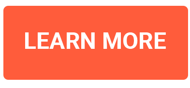
#MMsuperherotip: Using the power of color psychology, try playing around with different CTA button colors. CTA button colors that contrast with its surroundings tend to attract more attention (e.g. green CTA button against a grey landing page).
Idea #3: Enrich your image(s) with words…with a caveat
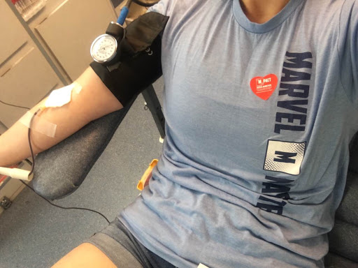
Interestingly enough, this last idea was pure happenstance. Our team recognized a positive correlation between including certain, punchy phrases in an image and CTOR (click-to-open rate) for the image, so we decided to explore this concept further. Long story short, this hypothesis worked, and I would highly recommend testing this out in your next experiment.

#MMsuperherotip: If possible, include decision-based language that the reader can take action on, as seen in the above example.