Back in 2000, the average American spent 9.4 hours online each week. Now, that number has ballooned to 23.6 hours per week. A whopping 84% of people access the internet from their smartphone, and 62% of people believe that the internet is an important tool for maintaining social relationships.
But if you think this digital revolution has made print marketing collateral go the way of the Dodo Bird, think again.
Print collateral is still a must-have, no matter how big your digital presence is. After all, it gives your target audience something to physically grab and take with them. Plus, printed material doesn’t come with all of the distractions that digital screens do–like pop-up notifications and ads. Science has even shown that physically holding a piece of paper and reading from it creates a deeper reader response because it’s a multisensory connection.
OK, so print marketing collateral is important. So how do you create the most successful collateral?
1. Have a clear call-to-action
Whether you’re making a brochure, flyer, fact sheet, or price list, you need a CTA that’s prominently displayed and easy to follow. That way, when you leave your collateral behind, people will know exactly what to do with it.
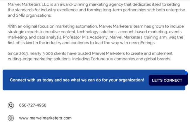
For example, we’ve created case studies here at Marvel Marketers that can be printed out and passed out at events. At the end, the CTA is clear–”Let’s Connect.” We even used a different color to draw extra attention to the CTA. Below it, you’ll find our web address and our phone number so that you know exactly how to connect with us.
2. Keep it consistent with your digital brand
Someone should be able to pick up a piece of your print collateral and immediately know who created it, even without looking at the logo. In order to do that, you need to make sure that everything is consistent with your digital brand. That means using the same colors, brand guidelines, imagery, and tone of voice that you would use online.
Check out the infographic we made for Professor M’s Academy:
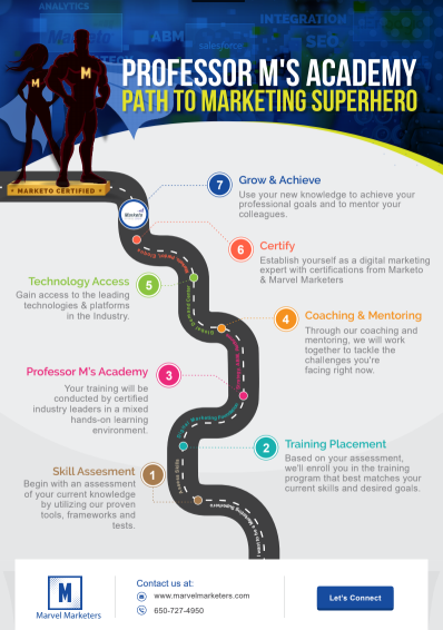
If you saw this sitting on a table at a conference or tradeshow, you’d immediately know that Marvel Marketers created it, thanks to our colors, superheroes, and sophisticated (yet conversational) copy.
3. Make it a convenient size
If you’re going to ask people to carry something with them, make it easy for them to do so. For example, a poster-sized infographic isn’t something that’s easy to grab off a table and take home. Even an 8.5″ x 11” printout can be cumbersome if you’re at a busy event with lots of other swag to carry around.
For example, at Adobe Summit 2019, we created a 5 x 7 card that concisely explained all of our services:
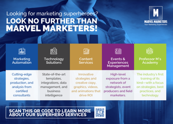
This was the perfect size because we had enough room to share our message, but the card was still small enough to tuck into a purse or briefcase. As an added benefit, the card material was much more durable than traditional paper in case someone wanted to fold it up and stick it in their pocket.
4. Think outside the box
As powerful as a great flyer, card, or brochure can be, don’t stop there. You can print a powerful message just about anywhere, and the more creative you get, the more likely people are to remember you.
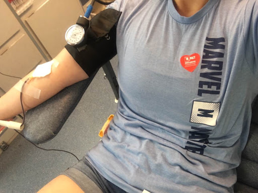
For example, when Marvel Marketers’ non-profit foundation, Mpact, was a Community Partner in The Oakland A’s Blood Drive, we decided to create collateral that was very specific to the event itself. The end result? A superhero stress ball (with our logo!) that people could squeeze while they were donating blood. We also printed heart-shaped stickers (again, with our logo!) that donors could wear afterward to let people know they’d just singlehandedly saved 3 lives:
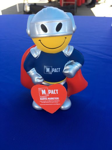
As you can probably imagine, both were a huge hit. After all, how can you not love that little superhero’s face?!
See how powerful the right print collateral can be? Now, hop off your computer and start brainstorming some print collateral ideas that will make your brand stand out.
