

The marketing strategies you create are only as good as the actionable insights you’re able to draw from your data. And in order to get the most out of your data, you need to create phenomenal reports.
Here’s how:
1. Have a powerful strategy planned from the get-go
As soon as you know you will be reporting on a campaign, it is important to keep in mind the type of metrics, trends, or insights you are planning to pull from the results. Get a good understanding of what your manager or stakeholder is trying to achieve. If your manager or stakeholder does not really know, dig deeper and conduct a full discovery on all team members involved. Ask questions about what data or insights are important, look for areas that can use improvement, and find out how they utilize or plan to utilize the report.
2. Establish a test plan
If you will be running a test, having an established test plan from the beginning is the key to success. Think about the size of the audience. Will there be enough data gathered to pull anything significant after the campaign? I have run tests for clients before where subject lines were randomly chosen every week solely for the sake of testing. When it came time to report on the results, we had trouble pulling any actionable insights as there were so many variables tested in the subject lines that the results were not significant. For more on subject line testing strategies, check out this post from one of my fellow superheroes.
3. Look for trends
Search for correlations between different types of reports — Marketo has so much to offer! Compare data over different time periods to look for spikes in the variables. Here are charts created from a Company Web Page Activity Report that was pulled from Marketo:
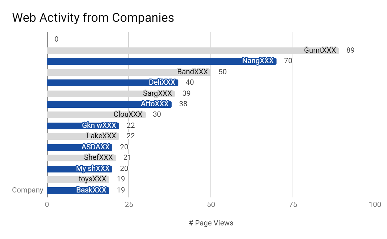
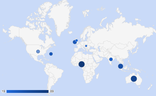
(Superhero credit to Sophie Lee for creating these charts)
While analyzing these charts, ask yourself helpful questions:
- When and where does target account activity increase? Why could this be?
- Are there a lot of anonymous leads? There could be a need for more conversions.
- Do you see any trends when you toggle by activity date? Week-over-week? Month-over-month?
- Can you see any strong relationships between some of the regions?
4. Presentation matters
The way data is displayed can make or break your message, so use a template that can be continuously improved over time. Paste linked charts into your presentation so that the raw data can be easily updated over time, too. It’s important to provide branding and design consistency across all of the reports in your presentation. A copy of your company’s most recent style guide can be a great resource. Spend some time learning about the different charts available in the tools you are using and how they can help convey your message, or even display trends that you did not know where there before.
5. Provide insight and recommendations
Simply presenting data in a fancy chart does not go the full mile. The purpose of reporting is to reflect on marketing efforts and use insight to determine what when well and what did not, ultimately improving your strategy over time. Even though this insight might be obvious to you, as you may have spent hours running the campaigns and digging up the data, this insight is not always obvious to the person you are presenting to. Since you are already an expert on this data, your recommendations on how to improve moving forward should be taken seriously.