The majority of organizations don’t give much thought to their websites once they’re up and running. Unless there’s some kind of technical snafu, you probably aren’t actively thinking about ways to improve your user experience and boost conversions.
Unfortunately, though, there are a lot of websites out there that aren’t reaching their full potential. How do you know if yours is one of them?
1. Your brand voice isn’t right
Whether you’re formal and technical or casual and conversational, your audience has come to expect a specific voice from your brand. If the voice on your website doesn’t match the rest of your brand, you’ve got a huge disconnect on your hands—and that’s not something that encourages people to do business with you.
Want an example of a website that gets their brand voice just right? Spin Sucks. The name alone tells you that this is a group with a sense of humor. With a name like that, the content on their website would look strange if it was really formal. A name like that calls for whimsical content that’s just as valuable as its more reserved counterparts.
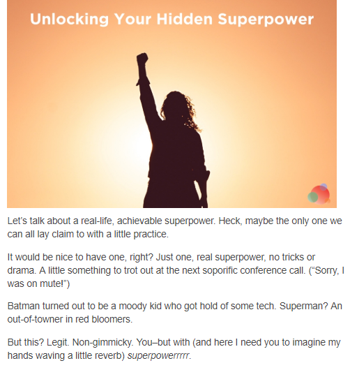
Check out the opening to one of their recent blog posts:

Exactly what you were expecting, right?
2. Your users leave with more questions than answers
Great websites explain how a product or service makes the buyer’s life easier. That explanation can be done in a variety of ways–sales copy, blog posts, infographics, and videos, just to name a few. But no matter how you do it, your explanation has to be clear and concise. If your content meanders all over the place without making any concrete points, your website visitors aren’t going to know what you do or why they should choose you.
Content isn’t the only thing that can confuse your website visitors, though. Poorly designed navigation, broken links, and images that don’t relate to the words that accompany them can all leave your visitors feeling lost. Unfortunately for you, lost website visitors don’t take much time to try and find their way. Instead, they leave the site altogether.
3. You’re too focused on SEO
Yes, search engine rankings are important, but at the end of the day, a search engine isn’t going to buy your product or invest in your service. If your website doesn’t cater to the actual people who are visiting it, all of that search engine traffic won’t do you much good.
What would you think if you landed on a website that was written like this?

Even if this website ranked #1 for its target keyword (which it wouldn’t, because Google admits to penalizing content like this), you probably wouldn’t have a ton of respect for it. If you have content like this on your website, you need to get rid of it, like, now.
4. It looks funky on mobile devices
By 2021, it’s estimated that 67.2% of e-commerce sales will come from mobile devices. And we’re not talking about little purchases. In 2018, the average value for an order placed on a smartphone was $84.55, and the average order value on a tablet was $94.91.
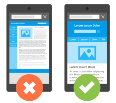
You’ve undoubtedly come across websites that are unresponsive, meaning that they don’t scale properly when viewed on mobile devices. The end result? Lots of scrolling with your fingertip, unwieldy images, and frustrated visitors.
Here’s the difference between an unresponsive website and a responsive one:

Which one would you rather spend time browsing?
This can be an especially big problem for landing pages. If someone can’t enter their information because the form is too difficult to use on his mobile device, your website has just cost you a lead!
Bottom line—solving these common mistakes isn’t hard for the right professionals, and making these improvements can work wonders for your business. The sooner you give your website a major makeover, the sooner you can start reaping the benefits!
Did you enjoy this post? Leave a comment for our superheroes below.
Want to read more of our superhero-approved tips and best practices? Subscribe to our blog at the top of this page!


